In the sprawling lineup of bookshelves and online book listings, a compelling book cover acts like a beacon, drawing readers to a particular title among thousands. The saying “don’t judge a book by its cover” may be age-old wisdom, but let’s face it: a book’s cover often serves as the first introduction to a book, making it a crucial aspect of a book’s marketing and appeal.
So, what makes a book cover stand out? An iconic cover often reflects the actual work. The best book cover designs usually capture the book’s depth and uniqueness, which makes them stand out and captivate readers. Over the years, we’ve seen many covers that are not only stunning but also emblematic of the stories they enclose.
What makes a book cover iconic?
Iconic book covers masterfully combine artistry and symbolism, capturing the essence of the narratives within. Their standout features include imagery deeply linked to core themes, unique typography that becomes part of the book’s identity, and a timeless design that remains relevant across generations.
Many iconic covers favor simplicity, emphasizing a central image with captivating colors or contrasts. Intrigue is crucial; a touch of mystery can draw readers in, as can designs by esteemed artists that perfectly align with the story’s content. Ultimately, the cultural significance of a book amplifies the impact of its cover, setting it apart in literary circles.
Elements of an Eye-Catching Book Cover
Let’s delve into the key elements that characterize the best book cover designs. Here are some key elements that define the most iconic book covers:
- Minimalist elegance: One of the key components of the best book cover designs is a penchant for minimalism. Rather than relying on intricate visuals, a simple yet poignant image or strategic typography can create a magnetic pull (see Paul Bacon’s design of Catch-22 below), compared to elaborate illustrations or intricate designs that usually distract. This simplicity often allows for a deeper emotional or thematic resonance.
- Metaphorical imagery: Books with literary merit often thrive on layers of meaning, with their depth and subtext finding their way onto the book covers. The best cover designs for this type of book leverage images that resonate on multiple levels, those that aren’t just literal representations but also offer symbolic or metaphorical depth (see E. Michael Mitchell’s design of The Catcher in the Rye below), urging readers to dive in and uncover those layers.
- Bold and unconventional designs: When exploring what makes a book cover stand out, audacity cannot be overlooked. While minimalism is a popular choice, the best literary fiction covers aren’t afraid to be bold, often leaning towards subtlety in content. Covers often break norms with stark contrasts or unconventional imagery, instantly grabbing attention (see Francis Cugat’s design of The Great Gatsby below).
- Emotionally evocative art: The human experience is central to the art of storytelling and book writing. Therefore, the best book cover designs often evoke a strong emotional tone, be it melancholy, tension, exuberance, or any other potent emotion that aligns with the book’s core themes (see Cardon Webb’s cover design of A Little Life below).
- Top-tier artistry: With quality books aiming for excellence in prose, it’s only fitting that their covers showcase high-quality artistry by commissioning renowned illustrators and photographers. In particular, most books in the literary fiction genre often employ top-notch designers to produce art that could easily be hung in a gallery.
- Distinctive typography: The question of what makes a book cover stand out can often be answered with unique typography. The choice of font and its arrangement can make a significant difference (see Tony Palladino’s design of Psycho below). Sometimes, the typography itself becomes the primary design element, with letters sprawling, intertwining, or otherwise engaging with the cover in unexpected ways. Engaging layouts, unusual fonts, and creative arrangements can elevate a book’s appeal.
- Tactile elements: Physical copies of literary fiction, in their quest for the best book cover designs, often add tactile elements. In an age where ebooks are increasingly popular, physical copies of literary fiction often come with tactile enhancements to their covers, such as embossing, matte or glossy finishes, or special textures. These elements provide an added sensory experience for readers.
- Consistency in author branding: For prolific authors, maintaining a consistent design theme across books aids in recognition. Authors who have penned multiple works usually demand a consistent design or branding approach, which helps loyal readers easily identify their new releases (see Paul Bacon’s design of Philip Roth’s Portnoy’s Complaint, which became part of Roth’s brand). However, this consistency doesn’t mean monotony; each cover should offer something fresh while staying true to the author’s established aesthetic.
- Intrigue is key: The best literary fiction covers not only represent the book’s content but also create a sense of mystery or intrigue. Beyond representing content, the best book cover designs instill a sense of curiosity. They entice potential readers, urging them to explore the story between the covers.
- Timeless appeal: What makes a book cover stand out for years? While trends in cover design come and go, the most iconic covers have a timeless quality. Irrespective of passing trends, the best book cover designs continue to captivate audiences long after their initial release, echoing the lasting appeal of the classics in those pages between them (see Antoine de Saint-Exupéry’s design of The Little Prince below).
The best book cover designs serve not just as decorative facades but as reflective canvases. Through a harmonious blend of artistry and strategic design, they aim to answer the ever-persistent question: what makes a book cover stand out?
Challenges of Crafting Book Covers from the Designers’ Perspective
Crafting an effective cover poses unique challenges for designers, requiring them to strike a delicate balance between capturing the essence of the story and appealing to potential readers. Solving these design problems requires a deep understanding of both literature and visual communication.

One of the main challenges faced by designers is how to visually represent abstract concepts or complex themes. Designers must find innovative ways to visually communicate nuanced emotions and philosophical ideas found in the book that are not easily translated into visual form, without resorting to clichés or generic imagery.
Another challenge lies in capturing the essence of a story without giving away too much. Literary fiction, for example, often thrives on ambiguity and subtlety, leaving room for interpretation and exploration. Designers must carefully select elements that hint at the themes or tone of the story without revealing key plot points or spoiling the reading experience.
Another obstacle lies in understanding the target audience. While some genres may have more clearly defined demographics, others span a wide range of ages, interests, and backgrounds. Designers must navigate this diversity and create covers that resonate with a broad spectrum of readers while remaining faithful to the essence of the story.
Some of the Most Memorable Book Cover Designs
Book covers are the first thing we notice when we pick up a book; they are more than just a protective layer—they serve as an initial touchpoint for the reader. While the internal content is vital, a cover can significantly sway a reader’s choice to engage with the text.
In this section, we explore the significance and artistry behind some of the world’s best book cover designs.
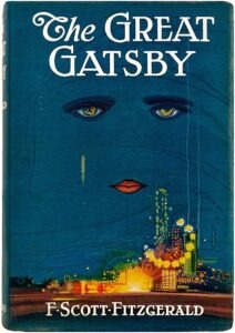
The Great Gatsby (1925) by F. Scott Fitzgerald, designed by Francis Cugat
The most iconic cover for The Great Gatsby features a pair of melancholic eyes and lips floating in a dark blue night sky over a glowing cityscape. These eyes are commonly interpreted as the eyes of Dr. T.J. Eckleburg, the billboard advertisement in the novel that oversees the Valley of Ashes, symbolizing both God’s watchful gaze and the moral decay of society.
Source: Nate D. Sanders auctions
The eyes also mirror the novel’s themes of surveillance and judgment. The glowing city beneath speaks to the allure and sparkle of the Jazz Age, the grand parties, the wealth, and the seductive nature of New York City during the Roaring Twenties.
The title and the author’s name are in an Art Deco-inspired font, which perfectly captures the 1920s era. The bold, uppercase letters give an air of grandeur, fitting for the larger-than-life world Fitzgerald describes. Additionally, Art Deco was synonymous with luxury, glamour, and a faith in social and technological progress—all of which relate closely to the novel’s themes.
The use of a deep blue night sky evokes a sense of melancholy and mystery. This color choice reflects the novel’s somber undertones, the secrecy surrounding Jay Gatsby, and the sadness that pervades many of the characters’ lives. The bright yellow lights of the city contrast with the blue, signifying the allure and opulence of the Jazz Age but also its artificiality.
The balance between the dark sky and the illuminated city below provides a visual separation, mirroring the novel’s social dichotomies (East Egg vs. West Egg, old money vs. new money). The eyes, centrally placed, draw immediate attention, symbolizing the ever-watchful gaze of society and the inescapable past.
Francis Cugat’s cover art perfectly captures the book’s main themes, which include the pursuit of the American Dream, the Jazz Age’s outward appearance, the decay hidden beneath the opulence, and the pervasive presence of judgment. By fusing together vibrant and somber elements, it mirrors the contrast present throughout Fitzgerald’s narrative—the juxtaposition of light and dark, hope and despair, reality and illusion.
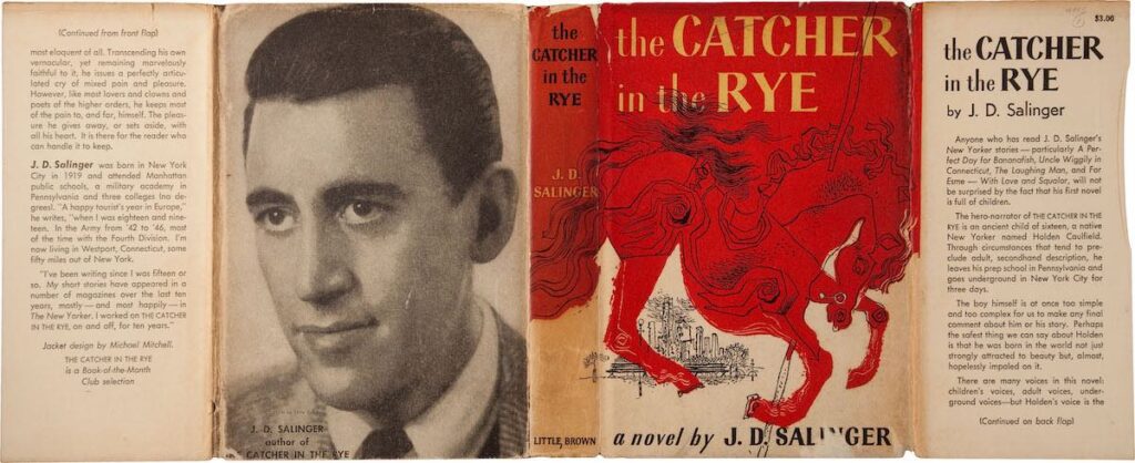
The Catcher in the Rye (1951) by J. D. Salinger, designed by E. Michael Mitchell
E. Michael Mitchell’s design for The Catcher in the Rye is simple yet evocative. The primary visual element is the depiction of a carousel horse, which directly references the scene near the end of the novel where Holden Caulfield watches his younger sister, Phoebe, ride a carousel in Central Park. This scene is symbolic of Holden’s desire to protect the innocence of childhood and his struggle with the inevitability of growing up. The carousel going in circles is a poignant metaphor for Holden’s own stagnation and repetitive patterns of behavior.
Source: Nate D. Sanders auctions
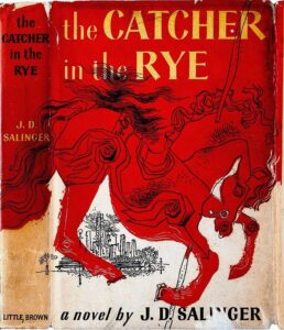
The cover employs a subdued, almost muted palette, predominantly in shades of red and brown. The choice of these warm, earthy tones may be seen as reflecting Holden’s quest for authenticity and genuineness in a world he perceives as insincere. The red might also allude to the iconic red hunting hat Holden wears throughout the novel, symbolizing his uniqueness and desire for protection.
Mitchell’s design encapsulates the novel’s primary themes effectively. The carousel horse is not just a literal reference but a symbol of Holden’s inner turmoil—his desire to preserve innocence and his fear of change and adulthood. The minimalist design echoes the novel’s sparse, direct prose and Holden’s disdain for anything superfluous or “phony.”
Many teenagers and young adults who read The Catcher in the Rye identify with Holden’s feelings of alienation and his critique of adult hypocrisy. The cover’s simplicity might have appealed to this demographic, as it doesn’t patronize or attempt to glamorize the story’s content. It offers a direct and genuine representation, much like Holden’s own narrative.
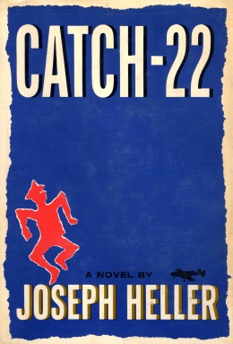
Catch-22 (1961) by Joseph Heller, designed by Paul Bacon
Paul Bacon’s cover design for Catch-22 is evocative and intriguing. The primary visual is a distressed figure, shown mid-motion, with arms outstretched, encapsulating the central character’s sense of confusion, despair, and entrapment in the bureaucratic absurdity of war. This representation immediately conveys the sense of chaos, bewilderment, and the inescapable circular logic that defines the “catch-22” situation itself.
Source: Wikimedia.org
Bacon was a luminary in the world of book cover design, and his design for Catch-22 is a testament to his brilliance. His “Big Book Look” style, characterized by bold typography and a central symbolic image, became iconic and was emulated by many designers after him. The design for Catch-22 not only captured the novel’s essence but also defined a new era in book cover design, emphasizing symbolism and simplicity over literal representations of the plot. The cover’s enduring relevance speaks to its effectiveness; even modern editions of the book often pay homage to Bacon’s original design.
Bacon’s design masterfully encapsulates the novel’s essence. The figure’s distress reflects the protagonist’s struggle against an impersonal, absurd bureaucracy. The term “catch-22” represents an illogical, self-perpetuating loop, a situation where one is trapped by contradictory regulations, and the cover’s design—through imagery, typography, and color—communicates this complexity and futility.
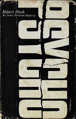
Psycho (1959) by Robert Bloch, designed by Tony Palladino
One of the most instantly recognizable features of Tony Palladino’s design for Psycho is the unique typography. The title, written in bold white letters, is fractured and disjointed, with parts of the letters seemingly cut or ripped away. This fragmented typography is an ingenious design choice, subtly hinting at a mind that is broken or unstable, mirroring the psychological unraveling central to the book’s plot. The seemingly jagged and erratic breaks in the lettering can also evoke thoughts of violence or unpredictability.
Source: Wikimedia.org
The cover, in its most iconic version, primarily uses a stark black and white palette. The black background, devoid of any details, serves as an effective canvas for the fractured white title, making it pop and immediately grasping the viewer’s attention. Black and white often symbolize contrast, dichotomies, and opposites, a fitting representation for the duality present within the character of Norman Bates and the contrasting worlds of reality and delusion.
What’s striking about Palladino’s design is the intentional absence of direct imagery. Many book covers use illustrative visuals to give readers a glimpse of the story’s content or characters. However, for Psycho, the choice to eschew any overt imagery and rely solely on the broken typography as the main visual element is bold and effective. It creates an air of mystery and invites readers to dive into the book to understand the significance of the fractured title.
The design’s composition is minimalistic, with the fractured title taking center stage against the stark black background. There’s a sense of asymmetry in how the title is broken, which disrupts the balance and further adds to the unease it aims to evoke. The minimal elements on the cover ensure that the viewer’s focus remains undistracted and entirely on the title.
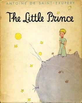
The Little Prince (Le Petit Prince, 1943) by Antoine de Saint-Exupéry, designed by the author
Antoine de Saint-Exupéry’s cover for The Little Prince is both minimalistic and evocative. At the center of the cover stands the figure of the Little Prince himself, often depicted with his signature blond hair and a thoughtful, distant expression. Around him are the vast expanses of his tiny home planet and the vastness of space.
Source: Wikimedia.org
The small planet that the Little Prince stands on symbolizes the isolation and solitude that humans can often feel, even on a vast planet like Earth. The empty space around the Little Prince symbolizes the vastness of the universe and the endless possibilities of exploration, both literally and metaphorically.
The Little Prince is a philosophical tale that delves into the complexities of human relationships, love, loss, and the quest for understanding. The cover, with its depiction of the Little Prince gazing into the distance on his tiny planet, encapsulates his journey of exploration and the profound loneliness and longing he feels. The design beckons readers to join the Little Prince on his voyage of discovery.
For those familiar with the story, the cover is a poignant reminder of its lessons; for new readers, it’s an intriguing invitation to delve into the tale. It serves as a visual entry point to the book’s profound lessons, making it one of the most iconic and timeless covers in literary history.
A Little Life (2015) by Hanya Yanagihara, designed by Cardon Webb (photographed by Peter Hujar)
The cover of A Little Life features a haunting black-and-white photograph of a man’s face, taken by the renowned photographer Peter Hujar. This close-up shot captures the subject with his eyes closed, his expression both serene and agonized, capturing an intimacy that’s arresting to any onlooker.

Source: Wikimedia.org
The intensity of the photograph is palpable. It encapsulates a range of emotions—pain, serenity, vulnerability, and contemplation. Much like the characters in Yanagihara’s narrative, especially the central figure of Jude, the man in the photograph seems to be wrestling with deep-seated pain and trauma. His closed eyes can symbolize both an escape from the harsh realities of the world and an introspective journey into one’s own mind.
The choice to retain the photograph in black and white is a deliberate and effective one. The monochromatic palette is both stark and emotive, setting the tone for the deeply emotional narrative contained in the book. The stark contrast between light and shadow on the subject’s face mirrors the novel’s exploration of friendship, love, and the shadows of past trauma.
The decision to use Peter Hujar’s photograph is a significant one. Hujar was known for capturing intimate, unguarded moments with his subjects, and this photograph is no exception. The cover, with its evocative photograph, encapsulates the heart-wrenching journey of the characters, especially Jude. As readers delve into the story, the image becomes emblematic of Jude’s internal struggles and the overarching themes of the novel.
Further Reading
- A Brief History of Book Covers by Alessandra Cesarato, Domestika
- Meet the Designers behind Your Favorite Book Covers by Alexxa Gotthardt, Artsy
- Beautiful Covers: An Interview With Chip Kidd by Spyros Zevelakis, Smashing Magazine
- The Decline and Fall of the Book Cover by Tim Kreider, The New Yorker
- The Book Cover Review, a website featuring 500-word reviews of classic and contemporary book covers written by a variety of designers